What's new

New Kits 2015\16

DaSpurs

Well-Known Member
Jan 20, 2013
11,816
13,655
City away one is class.

To be honest, looking at all home and away so far...Chelsea take it easily, as much as it pains me to say.

The collar on the Southampton away is easily my favourite type of collar.

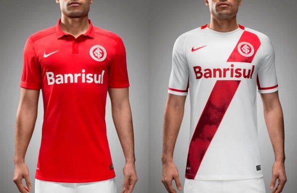
No doubt, those are quite sharp. Always appreciate when kit designers take the sponsor and try to make the kit work around it, as it makes the sponsor look less absurd. This year with the home, it's as if UA were completely oblivious that the sponsor would be red. I mean how they could design that shirt and not think "shit, this is a Fisher Price toy" is beyond me.
 

DaSpurs

Well-Known Member
Jan 20, 2013
11,816
13,655
I genuinely don't understand that third Newcastle kit. It's the same colour scheme as the home kit so when would they need to wear it?

Liverpool's looks fine but rather bland. United's kit looks very similar to recent Real Madrid away shirts.

After some of the ones they've had recently, I'll bet they're thrilled to have something on the bland side.

I'd be too for us next year. After the last couple years with our homes, I'd love to see us return to a more retro look next season.
 

Sweech

Ruh Roh Ressegnon
Jun 27, 2013
6,752
16,378
Personally I really like the clean Nike look.

The only team who can ever seem to pull off funky kits with consistency is Ajax.
 

Gbspurs

Gatekeeper for debates, King of the plonkers
Jan 27, 2011
26,997
61,920
Personally I really like the clean Nike look.

The only team who can ever seem to pull off funky kits with consistency is Ajax.

It suits them though, couldn't see us pulling off a green or black or neon orange etc.

Tbf I think our "Mocha" kit was ok and you don't see many teams going for a brown kit!
 

Qualsonic

Good Grief
Nov 24, 2010
3,063
6,693
Internacional, Brasil.

The red band on the away shirt is detailed with a flame effect.
internacional-maglie-2015-595x387.jpg
 

Metalhead

But that's a debate for another thread.....
Nov 24, 2013
25,456
38,528
Ok, so it's time for one of my favourite threads.
For no reason, other than the fact it's the first I found, here is Liverpools...

Liverpool-15-16-Home-Kit.jpg_(Share from CM Browser)


Well, it's red.
Nice to see New Balance in football though. I believe they took over Warrior's "soccer" division.
That's actually a really nice top.
 

Syn_13

Fly On, Little Wing
Jul 17, 2008
14,852
20,661
What'd you think of this one, @Syn_13?

JERSEY-PRANCIS-AWAY-OFFICIAL-WORLD-CUP-2014-S-M-L-XL.jpg


Personally, that one was my favorite of the tournament, especially since I thought it'd look brilliant on Spurs.

It's not bad, but I'm not a fan of the style. Seems a bit boring, but I get why people like it.
 

tommo84

Proud to be loud
Aug 15, 2005
6,227
11,311
Judging from the Liverpool and Stoke kits, New Balance seem to be keeping their designs very simple, which works great on kits with some inherent detail (like Stoke with the stripes) but looks quite dull on other kits. Will be interesting to see Liverpool's away kit.
 

WalkerboyUK

Well-Known Member
Jun 8, 2009
21,658
23,476
Apparently the new West Ham kit will have velcro on it so they can swap over the sponsors as and when each deal spectacularly collapses....
 
Last edited:

Insomnia

Twisted Firestarter
Jan 18, 2006
20,209
55,574
I miss adidas being our kit manufacturer, loved the 91 cup final shirt with the navy holsten on it
 

yankspurs

Enic Out
Aug 22, 2013
41,986
71,405
I'm a fan of black kits so I like the Bradford one and Vasco one you posted. Really beatiful kits.

But I actually really, really, really love that SKC 3rd kit. I love when teams deviate from their normal colors a bit and I'm a big fan of the white and silver/grey look. Wish they made that silver/grey a matte look though. Would have been even nicer. I'm a proponent of matte looks.
 
Top