What's new

New Kit 2014-15

SandroClegane

Well-Known Member
Jun 27, 2012
3,717
13,842
The away kit would be beautiful if not for the stripes- take those off and you have a great shirt.

But they are there, and they are awful.

You notice how the top kits- Chelsea, Man City, Real Madrid, Barcelona, Bayern Munich come to mind- don't seem to "try" anything- and as a result they don't end up with this kind of naff shit? Those clubs don't say "yeah, nice kit and all- but how but some tire-track, skid-mark, racing-stripe thingies coming up from the bottom and down from the top? I mean how cool would that be?" Instead, they just leave their kits alone: club crest, sponsor's logo, shirtmaker's badge, that's that.

We, on the other hand, try to make it "stylish." And this is the result.

The best kits we've had- e.g., some of the Holsten ones and the first Investec Cup shirt from two years ago- had in common that they were simple, honest, direct, and beautiful. No crazy patterns, no wild designs-- just club crest/sponsor's logo/shirtmaker's badge- job done.

These latest offerings demonstrate a fatal flaw with Spurs: much of the time, we can't seem to get out of our own way.
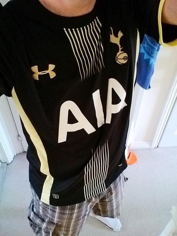
Sorry mate, but Barca and Bayern have absolutely "tried things" over the last few years, did you see Bayern's home kit this season? A lot of their fans absolutely hate it. Barcelona's fades and stripes have been very odd as well. And those are their traditional home kits. The away kits for all the clubs you named have been extremely experimental, especially compared to us.
 

THFC 1882

Well-Known Member
Jun 18, 2013
1,259
1,539
Bp2DPHMCQAAyeA1.jpg
 

ButchCassidy

Well-Known Member
Jul 12, 2012
3,986
15,846
I've seen worse, the AIA is horrendous though, probably the shittest logo of all time. On another note, would anyone else like to see UA do something a bit different with the numbers and letters on the back like Nike do? (eg Real Madrid shirt)
Won't happen. Levy already spent money developing our own proprietary THFC font, it will be on the kits for years to come.
 

coyspurs18

Mistakes were made
Jul 4, 2013
2,605
7,139
The away kit would be beautiful if not for the stripes- take those off and you have a great shirt.

But they are there, and they are awful.

You notice how the top kits- Chelsea, Man City, Real Madrid, Barcelona, Bayern Munich come to mind- don't seem to "try" anything- and as a result they don't end up with this kind of naff shit? Those clubs don't say "yeah, nice kit and all- but how but some tire-track, skid-mark, racing-stripe thingies coming up from the bottom and down from the top? I mean how cool would that be?" Instead, they just leave their kits alone: club crest, sponsor's logo, shirtmaker's badge, that's that.

We, on the other hand, try to make it "stylish." And this is the result.

The best kits we've had- e.g., some of the Holsten ones and the first Investec Cup shirt from two years ago- had in common that they were simple, honest, direct, and beautiful. No crazy patterns, no wild designs-- just club crest/sponsor's logo/shirtmaker's badge- job done.

These latest offerings demonstrate a fatal flaw with Spurs: much of the time, we can't seem to get out of our own way.

Who exactly decided these are the top kits? Everybody has their opinion yet you come on here and state yours as fact. Also, have you seen Real's pink kit? I guess that's nothing new though....
 

RichieS

Well-Known Member
Dec 23, 2004
11,916
16,436
Who exactly decided these are the top kits? Everybody has their opinion yet you come on here and state yours as fact. Also, have you seen Real's pink kit? I guess that's nothing new though....
He seems unable to distinguish between "top teams" and "top kits". His list is arguably a list of the former.
 

Chris12

Well-Known Member
Mar 6, 2013
7,293
13,252
Who exactly decided these are the top kits? Everybody has their opinion yet you come on here and state yours as fact. Also, have you seen Real's pink kit? I guess that's nothing new though....
Whoa whoa whoa, that's a fine piece of kit sir! You have something against pink, say something!
 

ajspurs

Well-Known Member
Jul 7, 2007
23,276
31,693
I don't like it, I just hope it looks better in the player promotional pictures.
 

Lufti

Well-Known Member
Jan 3, 2013
7,994
16,635
I've seen worse, the AIA is horrendous though, probably the shittest logo of all time. On another note, would anyone else like to see UA do something a bit different with the numbers and letters on the back like Nike do? (eg Real Madrid shirt)

Yeah, those infamous nike branded real madrid kits :rolleyes:
 
Last edited:

fridgemagnet

Well-Known Member
Jan 18, 2009
2,449
2,909
Won't happen. Levy already spent money developing our own proprietary THFC font, it will be on the kits for years to come.

Did he?

I was under the impression all EPL player numbers had to be the same font, although i'll be honest it's not something i've paid a hella lot of attention to o_O
 

KaribYid

Well-Known Member
Jul 2, 2012
1,311
7,857
Did he?

I was under the impression all EPL player numbers had to be the same font, although i'll be honest it's not something i've paid a hella lot of attention to o_O

All EPL fonts are the same but the EL font is custom made one that the club paid someone to make.
 

Everlasting Seconds

Well-Known Member
Jan 9, 2014
14,914
26,616
I'm simple, and I like being simple. If the kit doesn't say "Holsten", I won't care about it. Then I suppose, "Holsten" wouldn't sell the club to a heap load of Asians now would it?
 

Tucker

Shitehawk
Jul 15, 2013
31,546
147,646
We know that fakes of these new kits have been available for a few weeks now, just because there are a couple of pictures of someone wearing it, doesn't make them any more genuine than they were before.
 

jedimonkey

COYS!
Jan 28, 2011
1,849
4,230
The away kit would be beautiful if not for the stripes- take those off and you have a great shirt.

But they are there, and they are awful.

You notice how the top kits- Chelsea, Man City, Real Madrid, Barcelona, Bayern Munich come to mind- don't seem to "try" anything- and as a result they don't end up with this kind of naff shit? Those clubs don't say "yeah, nice kit and all- but how but some tire-track, skid-mark, racing-stripe thingies coming up from the bottom and down from the top? I mean how cool would that be?" Instead, they just leave their kits alone: club crest, sponsor's logo, shirtmaker's badge, that's that.

We, on the other hand, try to make it "stylish." And this is the result.

The best kits we've had- e.g., some of the Holsten ones and the first Investec Cup shirt from two years ago- had in common that they were simple, honest, direct, and beautiful. No crazy patterns, no wild designs-- just club crest/sponsor's logo/shirtmaker's badge- job done.

These latest offerings demonstrate a fatal flaw with Spurs: much of the time, we can't seem to get out of our own way.

Seriously dude can you stop with the Chelsea love in. Their kits are not, never have been and never will be classy.

They are a shit shade of blue and worn by a bunch of ****s.

End of.
 

Hoddle&Waddle

Well-Known Member
Nov 25, 2012
8,359
17,609
Seriously dude can you stop with the Chelsea love in. Their kits are not, never have been and never will be classy.

They are a shit shade of blue and worn by a bunch of ****s.

End of.
Be great to have Adidas though, better than this crap we are being served up. Seriously, look at all the kits UA has made for us, there's something not quite right with every shirt (eg the shiny silver strips).
 
Top