

You are using an out of date browser. It may not display this or other websites correctly.
You should upgrade or use an alternative browser.
You should upgrade or use an alternative browser.
New Kit 18-19
- Thread starter Qualsonic
- Start date
- Aug 31, 2012
- 10,925
- 16,007
I don't buy the whole unique kits for everyone would cost the provider a fortune argument.
1. This is Nike. This stuff is already made dirt cheep to begin with.
2. It doesn't take that much effort and doesn't need to be a big divert from the overall template.. Just make the shoulders/sleeves navy blue and our kit would stand out more.
That the biggest/second biggest athletic wear producer on the planet doesn't want to put more effort into a kit made as part of a big, lucrative sponsorship agreement is just lazy
You need to watch the dulcet tones of Tony Hurst on "How It's Made"
Things like this are mass produced in high volumes. The manufacturer needs to first design it. There's a cost there. It's not just how it looks, it's the fit, material, technology and...
Then they have to make machines that can actually manufacture the fabric in the design they came up with, aaaaand
Then they need to figure out how to make them blue or white or red or green Etc.
Just be safe in the knowledge no one else will have our colours with our badge and our sponsor.
There you go, totally, 100% unique.
And all those savings, as has repeatedly been said, gets passed on to us in the deal.
Why whinge??
- Dec 8, 2005
- 7,831
- 9,372
Is that his haircut or is it an indicator for player one?
- Jun 6, 2005
- 53,432
- 67,177
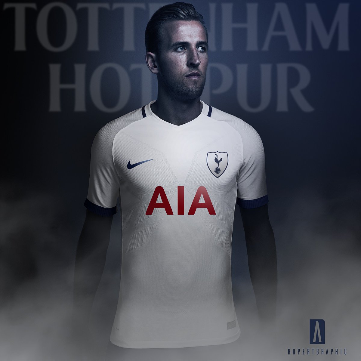
Mock up based on this season's nike template..
So @VinVega won, with this post on March 4th
")
Yeah, the paneling isn't on the button but the overall design is sound.
- Aug 24, 2010
- 10,400
- 12,476
Yet if the designers get busy, then people on here say, can't we just have a plain and simple kit, please? No win situation really.
even if we had a different design for our home shirt for each league game, guarantee there would be plenty that liked none of them
- Aug 31, 2012
- 530
- 890

The AIA seems excessively big in this pic; gotta be cheap imitation I hope?
The position of it just don't seem right - it's below your breast...
https://www.thesun.co.uk/sport/foot...eal-with-new-kit-supplier-nike-not-announced/
- Dec 22, 2005
- 2,553
- 2,569
One thing that I increasingly struggle to understand...we have the AIA logo, and it's red - it annoys me, but I at least understand the logic; it's their logo, their brand, they want it exactly as it would be seen elsewhere. But then, on the away kits, it's never red. So why does it have to be red on the home kit? Every kit we've had in the AIA era would look a million times better if the logo was navy blue - and not just because it's the colour of the enemy, it just doesn't go with the rest of the kit. Maybe that's the answer to my question - they make it look as garish and ugly as possible, ensuring more eyes on it.
- Jul 22, 2008
- 43,881
- 95,149
One thing that I increasingly struggle to understand...we have the AIA logo, and it's red - it annoys me, but I at least understand the logic; it's their logo, their brand, they want it exactly as it would be seen elsewhere. But then, on the away kits, it's never red. So why does it have to be red on the home kit? Every kit we've had in the AIA era would look a million times better if the logo was navy blue - and not just because it's the colour of the enemy, it just doesn't go with the rest of the kit. Maybe that's the answer to my question - they make it look as garish and ugly as possible, ensuring more eyes on it.
As you say, it stands out more. Red on navy wouldn't work.
It does completely ruin the shirt. Ugly font and a horrible combination, regardless of its association with the gooners.
- Aug 1, 2011
- 1,369
- 4,020
I hope the home has Navy shorts and personally I prefer Navy socks too.
I guess that would then mean having white shorts with the away kit for differentiation, when I think that would look smart all Navy.
I always think one of the two away kits should be all yellow, but I guess you can't have everything.
I guess that would then mean having white shorts with the away kit for differentiation, when I think that would look smart all Navy.
I always think one of the two away kits should be all yellow, but I guess you can't have everything.
- Jul 24, 2013
- 14,145
- 44,268
Best kits since the addidias ones

- Jul 19, 2015
- 6,647
- 27,841
So @VinVega won, with this post on March 4th
Yeah, the paneling isn't on the button but the overall design is sound.
Not really. That's totally different other than the logos on it. We all knew the Nike template for THIS season would be used (and the Man City one was the most accurate indicator as it was first announced.)
- Jul 19, 2015
- 6,647
- 27,841
Can't help feeling these leaked shirts - which are likely close to the real thing - lack some navy trim. Perhaps on the shoulders to define the top of the shirt, or at the front of the neck, or bottom of the sleeves too maybe.
I think you'll find the most recent photos are the actual kit.
- Feb 2, 2005
- 2,376
- 4,784
as long as the shorts are navy & the socks are either white or navy and they don't start a new tradition that looks like this ...
http://www.tottenhamhotspur.com/upl..._2013/AIA_trip/youth football 8319.jpg?n=1110
If they give us orange or red socks
http://www.tottenhamhotspur.com/upl..._2013/AIA_trip/youth football 8319.jpg?n=1110
If they give us orange or red socks
- May 5, 2005
- 21,646
- 45,356
Well they're plain and a bit boring as predicted with Nike but they're playing it safe with the first ones which is understandable, and the away shirt is a gorgeous blue colour, probably buy that one. Home could do with some more navy trim and I just don't understand the whole shield on the badge thing, looks like the opposite of what we were trying to achieve with the sleek new logo of the past few years.
Not sure why the third kit is purple - not sufficiently different to the away kit for me, yellow would've made more sense in terms of avoiding clashes.
I just hope the fit is good. I cannot stand baggy poorly-fitted football shirts. The most annoying thing is the replica is never the same as the proper kit one as they know they have to cater to fans who aren't exactly built like top footballers. But I wish they'd have a fitted version, or have the small and medium sizes fitted, if not the larger ones.
- Jan 28, 2011
- 14,122
- 18,503
Finally a clean simple kit
Puma and UA always included some stupid detail.
Loved this puma shirt to be honest, pretty simple and classy, reminds me of Modders, Rafa and Bale
, think we thumped Liverpool 4-0 wearing this one.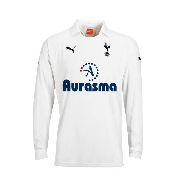
- Jul 24, 2013
- 14,145
- 44,268
Got red on it, mate.Loved this puma shirt to be honest, pretty simple and classy, reminds me of Modders, Rafa and Bale
- Oct 25, 2005
- 32,629
- 33,580
- Staff
- #860
Made out of kitchen roll?
That for Wanyamas benefit when he's mopping up the tears of players he's destroying.