- Aug 1, 2011
- 1,369
- 4,020
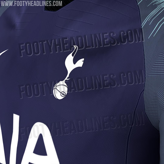
Isn’t teal similar to the light blue away kits of the early 80s?
Light blue/sky blue is fine in my book, but teal is more turquoise/aqua, not very Tottenham.

Isn’t teal similar to the light blue away kits of the early 80s?
If done right this could be beautiful
Isn’t teal similar to the light blue away kits of the early 80s?

Thanks. I dont know why i'm so lovedFuck me I've just noticed how many negative ratings you're on these days. That's actually quite impressive.
")
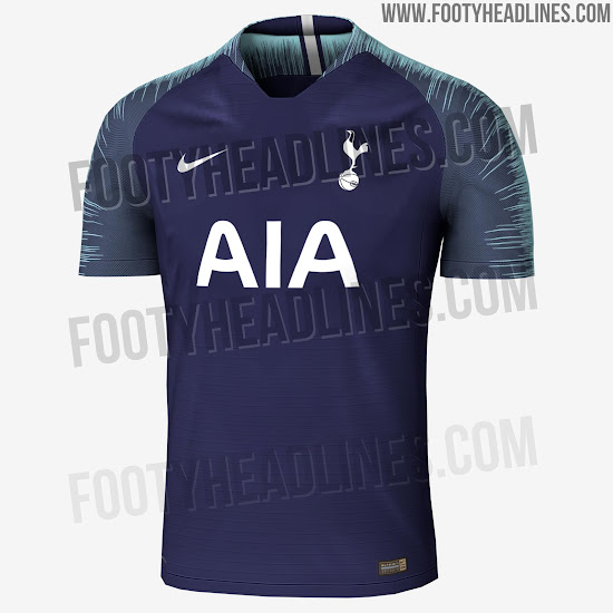

This would never happen imoNot sure I like that at all but then again, I'm not really a fan of that template that Nike are going to be using for a lot of next season. Really don't like those sleeves. This seasons was so much more slick and clean. Hopefully it's just a case of it looking better when on the players and shown in promotion and such.
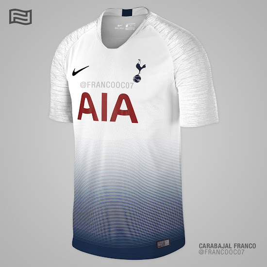
Here's a mockup of what the home could look like based on reports of how it will be. Whether it will look like this or not I don't know but I can't say I like a gradient effect on any shirt to be honest.
Beautiful.
No, the sleeves should always be the same colour as the rest of the jersey. To have different-coloured sleeves is too reminiscent of Le Scum de Woolwich.I think the home kit would look nice with that sleeve pattern done in blue. Keep the rest of the shirt white though. I think that would be smart. Blue shorts and socks too.