
- Apr 1, 2005
- 41,363
- 74,893
I wonder what colour our home shirt will be this season? Anybody know?!
White?

I wonder what colour our home shirt will be this season? Anybody know?!
White?
Because?
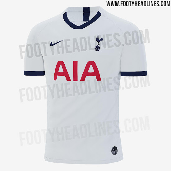
Looks nice and clean overall!
Hoping the away isn't just a navy and purple version of that and has a classier look like the Inter away one, with three colours incorporated in the design rather than just the two.
Looks kinda nice. I prefer something with a bit more about it, and I prefer when we have blue socks too. The last season at The Lane was my fave home kit in years.
My lawyers will be in touch.
Wonder if the sleeve bands go all the way around? Would look shit if they stop half way like the collar.
Looks nice and clean overall!
Hoping the away isn't just a navy and purple version of that and has a classier look like the Inter away one, with three colours incorporated in the design rather than just the two.
Think how good it would look without the Nike swoosh and the AIA though.
Looks nice and clean overall!
Hoping the away isn't just a navy and purple version of that and has a classier look like the Inter away one, with three colours incorporated in the design rather than just the two.
Definitely... Cant understand why we can't wear it next week, this seasons is a complete joke with white shorts.At least it'll look decent with white shorts in the CL, unlike this seasons
I really like the top, sometimes plain and simple is the best way to goI can't believe some of you are happy with that, they had a whole year to design something far different and much better than our recent home kit, and it's practically the same just with a few differences. Zero Effort.
I can't believe some of you are happy with that, they had a whole year to design something far different and much better than our recent home kit, and it's practically the same just with a few differences. Zero Effort.
These are our colours and the basic template for our kit. Really not sure what you’re expecting. I’m surprised we can’t come to some sort of compromise with AIA though. I appreciate their logo is in Red. But ultimately it’s about getting their name seen, would it really make any difference if it was in Blue.